EN
-
 PL
-
 EN
PL
EN
PL
EN

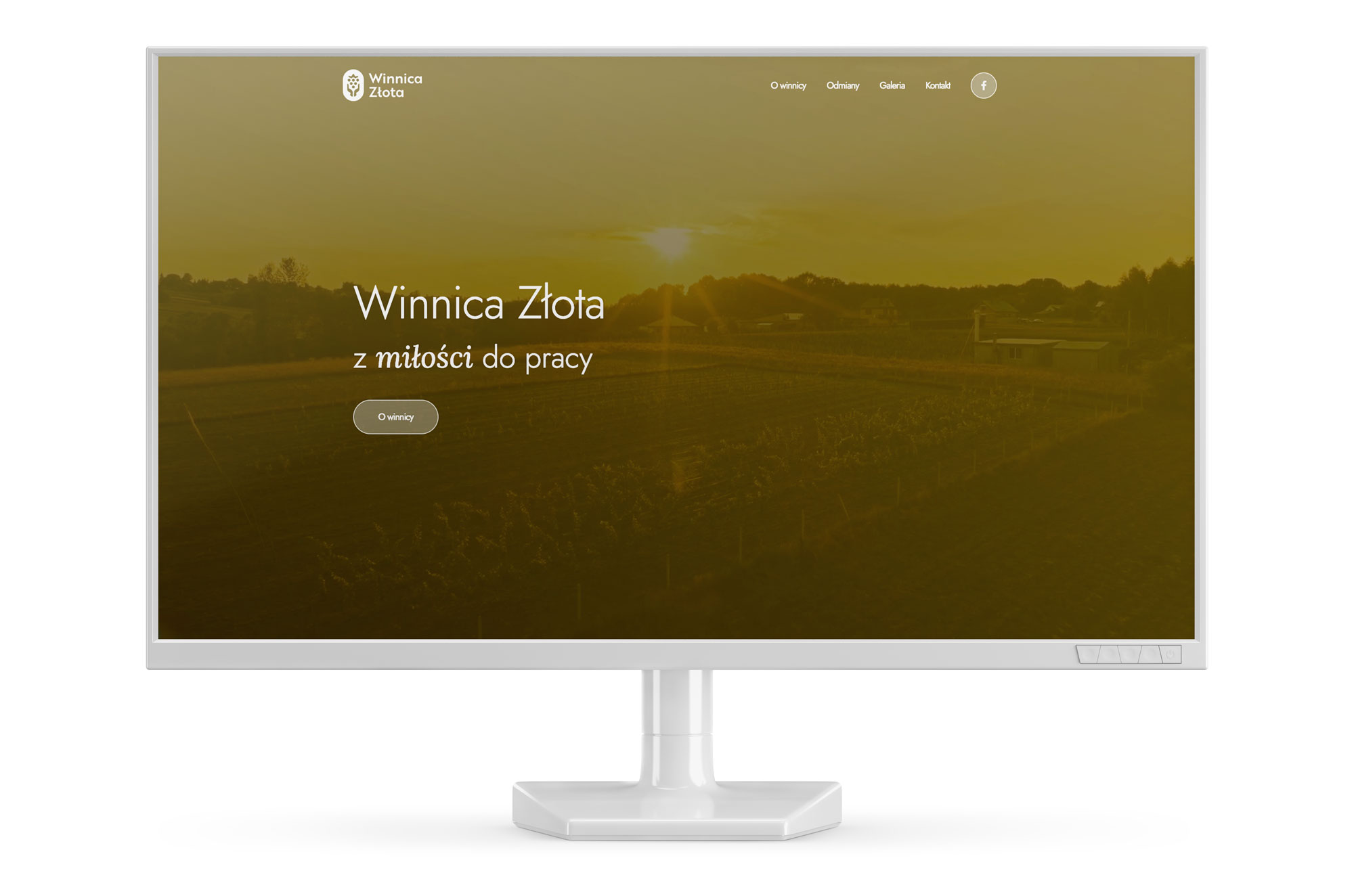
Winnica Złota is a vineyard cultivated naturally, using traditional methods, in the Małopolska village of… Złota :)
Brother 1816
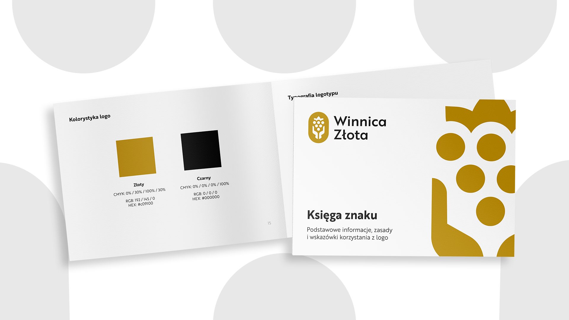
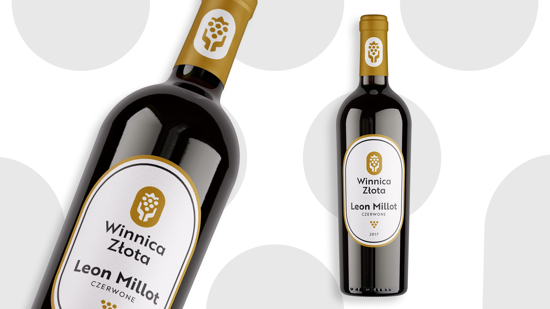
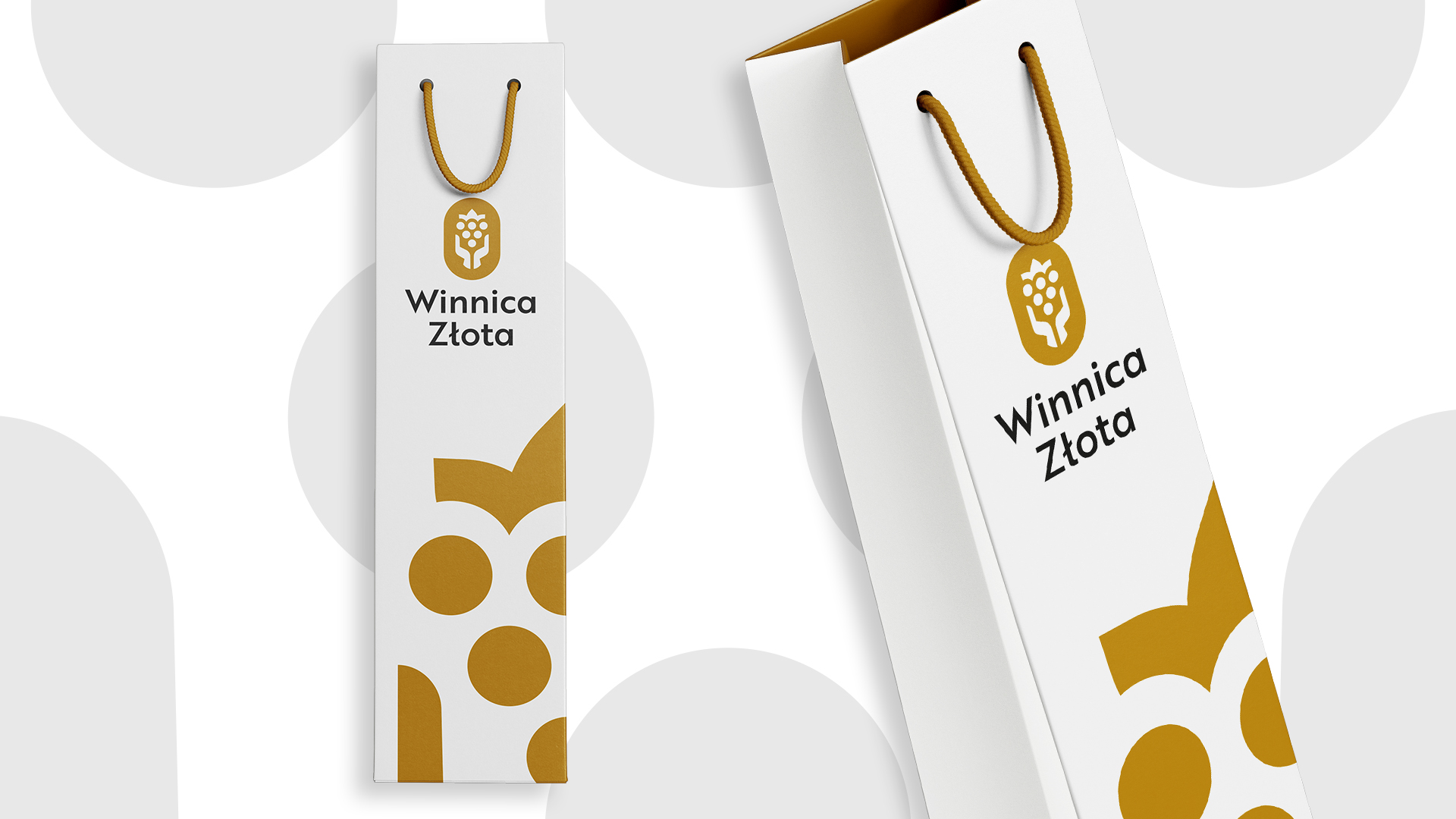
Working for Winnica Złota was special for us. It showed just how much conversation matters in design. The owner is a modest man with a strong work ethic. As is often the case, that ethic is so obvious to him that he would never think to name it as something that sets the brand apart. We spent hours listening to him describe the care he gives every little leaf, tending his vines so they grow naturally and healthily, without chemical “shortcuts”. So the branding isn’t just about wine. It’s about passion, patience and the work of human hands that won’t compromise.

Every road, even the longest, begins with the first step. Since you are reading this text, it means that you have already completed it. It's time for the second one - see our portfolio and/or contact us :)